
Table of Contents
As of 2018, 52% of global web traffic comes from mobile devices. In areas like Africa and Asia the percentage is even higher, and Google now considers mobile website versions to be more important than desktop ones.
While the world continues to shift towards on-the-go search queries, businesses must adapt their websites to reflect consumer preferences. Marketers now turn to an approach called “mobile SEO” to increase their consumer base by means of improved mobile web design and user experience.
What is mobile SEO?
Mobile SEO (search engine optimization) is the process of configuring your website for smartphones and tablets so that search engine crawlers can find and index your content. This digital marketing approach involves designing the mobile version of your website so that it is user-friendly, functional, and accessible, with the goal of improving your ranking on search engine results pages. Higher rankings are correlated with more organic traffic to your website, which means more potential customers for your business.
Why mobile SEO is so important
In 2015, Google announced that web pages would suffer in search engine results if they weren’t mobile-friendly. This sent webmasters into crisis-aversion mode, calling the new developments “Mobilegeddon,” or the end of desktop’s domination of the web.
After the initial success of increased mobile optimization, Google decided to switch to mobile-first indexing in 2020.
The current Google algorithm uses what’s called a mobile search index to rank and display search engine results. Essentially, Google used to display results based on which device the user was searching from.
Mobile users got mobile page results, while desktop users got desktop results.
Now, Google only displays information that it retrieves from its mobile index – even if the user is searching on a desktop.
Consumer mobile search trends support these changes, showing that more and more people are using smartphones and tablets to find the information, products, and services they need.
72% of people who own voice-activated speakers use them on a daily basis, and the total number in use is expected to rise over the next decade.
On top of that, more than half of all global search queries come from mobile devices. As these trends indicate, mobile SEO is a must-use strategy for every business that wants to be found in search engines.
Three ways to create a mobile-friendly website
There are three main ways to create a mobile-friendly website. They each cater to unique device configurations in a different way, but some require more work than others.
Dynamic serving
When you use dynamic serving, you have a website with different HTML/CSS code displayed on each potential device. A vary HTTP header tells the server which version of code to display depending on the “user agent”, or type of device, is being used.
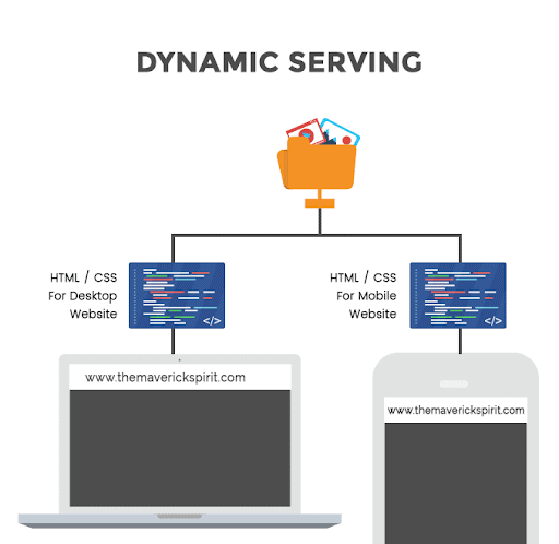
The major downside of this approach is that you consistently have to write fresh code for each new device.This means that every time Apple comes out with a new iPhone, you have to create unique code for it.
If you don’t code for each device, your users will likely see a version of the site that looks less than ideal. And even when you code for a new device, the server still may decide to show the wrong version to the user. The server does its best to detect the correct device but isn’t always right, so this approach doesn’t guarantee you a mobile-friendly site at all times.
Separate URLs
Another way to create a mobile-friendly website is to distinguish it from the desktop version by using a separate URL, known as an “M” site. So, rather than one URL that looks different on various devices, you have entirely separate URLs for all the pages of your mobile site.
 Unless you have access to an experienced web development team, this is probably not the best option.
When you create separate URLs you have to make use of the rel=canonical tag to avoid duplicate content issues. Plus, using an M site means that you have two websites to manage, even if the content on them is the same.
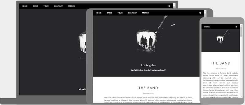
Responsive design
Using responsive design, or website formatting that automatically adjusts to each device, is the most practical way to ensure a mobile-friendly site experience. With this approach, you use one URL for all devices.
This eliminates the stress of managing multiple versions of the same content, as well as, the headache of avoiding duplicate content errors which negatively impact your rankings.
Instead, you use HTML responsive web design elements to tell the browser how to adjust your content.
Some of these web design elements include:
- CSS width property
- Responsive text size
- Media queries
- Viewport meta tag
- Different images displayed for different screen sizes
What’s great about a responsive site is that it works for you. After setting it up, the browser simply follows your instructions and displays your site optimally for each device.
If you know how to code, you can simply begin adjusting your HTML/CSS data to include responsive elements. For those with less coding experience, you can use tools like W3.CSS or Bootstrap to set up this format. Also, many WordPress and Wix themes have responsive design tools that eliminate the need for hand-written code altogether.
How to do mobile SEO for your website
Incorporating mobile SEO elements into your website is essential for increasing mobile traffic. The more user-friendly your website is, the better your performance on important SEO metrics like bounce rate, dwell time, and click-through rate (CTR).
Here are 10 mobile SEO methods you can use to improve audience engagement and score well on top search engine ranking factors.
1. Make sure Google can access and render your content
Certain website configurations can hide the content on your mobile pages from Google, making it harder for you to show up on search engine results pages (SERPs).
If you use lazy loading to decrease your website load time, check to make sure you’ve incorporated it correctly. This feature can prevent Google from accessing the content on your web pages.
Eliminate noindex or nofollow tags that direct crawlers away from your mobile content. Use the same meta robot tags for both the mobile and desktop versions while also ensuring that you don’t have a disallow directive which prevents Googlebot crawlers from indexing your page.
2. Don’t block CSS, JavaScript, or images
In the past, it sometimes made sense to block CSS, JavaScript, and images on the mobile version of your website because not all devices could correctly interpret and display the information. But modern smartphones are more than capable of supporting these components. So, you should unblock CSS and JavaScript to make sure that they are available for search engines to access and deliver to visitors in the most user-friendly way.
3. Make sure your content is the same on desktop and mobile
Because Google follows a mobile-first index model, the content on your mobile site should be just as comprehensive as the content you provide to desktop users.
The content on both desktop and mobile versions of your site should include the same:
- Heading organization
- Structured data–including the data on Accelerated Mobile Pages (AMP)
- Title tags and meta descriptions
- Detailed content and topic coverage
Especially given the priority that mobile websites have over desktop versions, providing the same high-quality content experience on both is essential to ranking well.
4. Boost page speed
According to Google, just a one-second delay in the time it takes your page to load could reduce your mobile conversion rate by 20%.
Modern consumers are used to instant gratification-based transactions. At the click of a button they can purchase almost anything they want. So when your website takes too long to load, users will simply go somewhere else to find what they’re looking for.
Fortunately, Google’s PageSpeed Insights tool allows you to analyze your speed performance using actual data. Here is an example of the report that this tool provides:
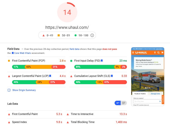
You’ll notice that it gives the website an overall score which belongs to one of three categories:
- Red: Poor
- Yellow: Needs Improvement
- Green: Good
Beneath the initial score you will see opportunities for improvement, along with the amount of time you might be able to shave off your overall page speed:
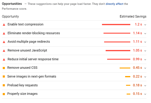
Improve your page speed by:
- Compressing and caching scripting data
- Reducing or eliminating content animations
- Optimizing images
- Deleting unnecessary data files
- Using HTTP caching
- Choosing a high-quality hosting platform
Once you’ve made your website faster, you should see a reduction in your page bounce rate and an increase in overall user experience.
5. Satisfy search intent
Search intent refers to the underlying motivation for a user’s search query. In other words, “why is someone searching for this and what are they looking for?”
To satisfy search intent, you must provide the kind of resource that the user needs. There are four primary types of search intent: navigational, transactional, commercial, and informational.
Consider a user who is planning a trip to Costa Rica and what types of searches they would make:
- Navigational: The user is looking for a specific resource, tool, or website. (Ex. “Airbnb”/“Google Flights”)
- Transactional: The user is looking to make a purchase. (Ex. “rent vacation home Costa Rica”/”buy inflatable travel pillow”)
- Commercial: The user is researching products and services to potentially buy. (Ex. “travel essentials for Costa Rica”/“zip-lining adventures Costa Rica”)
- Informational: The user is trying to learn more about a topic. (Ex. “history of Costa Rica”/“Costa Rica packing list”)
You can see that the user has different intentions with each search. Understanding what the user is looking for will guide your SEO content creation strategy once you’ve chosen target keywords.
6. Make sure your content is optimized for mobile screens
You need to present content in a way that is easy to read and access. On mobile websites, readers want to see all of the essential information without having to scroll for pages and pages.
Consider your content layout and fonts: Are they easily readable or do you need to adjust them for smaller screens?
Consider the size of links and buttons: Are they large enough for someone to tap with a finger or do you need to enlarge them?
Mobile content optimization is an important reminder that you should do away with filler content. It doesn’t serve the reader and takes up valuable space (especially on mobile websites) that you need to prove your content’s value.
Improve your readability with simple sentence structure, organized section headers, and a navigation menu so that the mobile site helps readers find what they need without endlessly scrolling.
7. Make sure pop-ups aren’t intrusive
Distracting pop-ups kill user experience quickly – especially on mobile devices. Because their screen sizes are smaller, mobile devices can only display a small amount of content at once.
Google will even penalize you for certain types of pop-ups that it deems obtrusive to user experience. Some of the acceptable pop-ups include cookie notifications, age verification, and small banners on the top of the screen When designing your mobile site, be careful about when and where pop-ups appear on the page. You don’t want to cover up the content that users are trying to read with customer service chats or email opt-in notifications.
8. Provide high-quality media
Create a top-notch user experience on your mobile site by incorporating high-quality images and videos.
Some video best practices to follow are:
- Submitting a video sitemap
- Eliminating robots.txt files or nofollow tags
- Creating high-quality thumbnails
- Using HTML5 markup language instead of Flash multimedia software
- Adding structured data to videos
Some image best practices to follow are:
- Adding descriptive alt text (see image below)
- Changing file names to match content
- Optimizing for SafeSearch with adult content tags
- Choosing high-resolution images
- Using captions and external linking for borrowed images

Multimedia optimization is an essential ingredient for a successful SEO strategy. The small amount of available screen space coupled with poorly-optimized media components can ruin page load time and drastically reduce your UX performance.
9. Optimize meta title and meta description for mobile
A meta title is the clickable link that users see on a results page. It tells users what the topic of the content is and is important for persuading people to visit your website. The optimal character count for a meta title is between 30 and 75. Anything longer and Google may truncate it.
The meta description lies right beneath the title, and its job is to further explain key details about the content. It can include things like brand information, product descriptions, a persuasive call-to-action, and more. Keep it to 130 characters or less so it doesn’t get cut off on the mobile screen. These meta details are important for getting users to click on your link. They are powerful because they must provide a great amount of incentive in a very small space.
On smaller mobile screens, the information in the meta title and description is even more important. With less surface area to state your case, you’ll want to put the focus keywords as early in the title and description as possible.
Using a plugin like Yoast SEO can help you optimize the title and description for mobile devices:
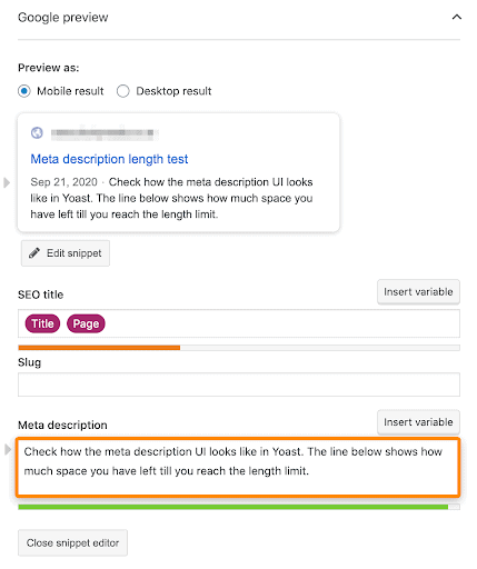
Being able to use the “Preview As” → “Mobile result” feature helps you to write concisely and to include only the most vital information.
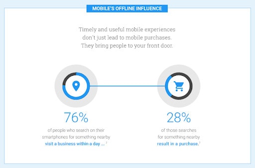
10. Optimize for local search
From 2017-2019 the amount of Google searches using the words “store open near me” (ex. “hardware store open near me”) increased by 250%. Take advantage of this specific web traffic opportunity by optimizing for local search results.
Some of the best local SEO techniques include:
- Claiming and optimizing a Google My Business (GMB) page
- Building NAP (name, address, phone number) citations
- Targeting local keywords
- Focusing homepage content to overall target keyword
- Using schema markup to earn a rich snippet SERP listing
Implementing some or all of these techniques entices mobile searchers to click on your SERP listing when they’re comparing local businesses on-the-go.
How to test your website’s mobile SEO
When you’ve implemented the previously-mentioned techniques, you need to test your site and make sure it displays properly on a mobile device.
Aside from pulling up your site on a smartphone and testing it yourself, there are several tools you can use to get feedback on your site’s mobile-friendliness:
- Google Search Console Mobile Usability report
- Small SEO Tools mobile test
- mobiReady
- Google Mobile-Friendly test
- Responsinator
- Rankwatch Mobile Responsiveness Test
The final test is essential for ensuring a positive user experience. In addition to these resources, try sending the mobile site to some of your trusted peers and have them browse around, looking for issues as they go. This will give you the opportunity to get real user feedback with which you can reconfigure your site to make it more appealing to search engine crawlers and viistors alike.
Get a complimentary SEO audit
As technology advances, the amount of mobile visitors and voice search traffic from Google will grow accordingly. Mobile SEO best practices allow your website to remain functional, relevant, and accessible – even as the landscape continues to transform around it.
Want to see how you’re doing with SEO? Get an instant SEO audit below. Or, schedule a free consultation to see how intent SEO can boost search traffic revenue by 700%.